Access the Online Archive
Search the Historical Archive of the Pirelli Foundation for sources and materials. Select the type of support you are interested in and write the keywords of your research.
    Select one of the following categories
  • Documents
  • Photographs
  • Drawings and posters
  • Audio-visuals
  • Publications and magazines
  • All
Help with your research
To request to view the materials in the Historical Archive and in the libraries of the Pirelli Foundation for study and research purposes and/or to find out how to request the use of materials for loans and exhibitions, please fill in the form below. You will receive an email confirming receipt of the request and you will be contacted.
Pirelli Foundation Educational Courses

Select the education level of the school
Back
Primary schools
Pirelli Foundation Educational Courses
Please fill in your details and the staff of Pirelli Foundation Educational will contact you to arrange the dates of the course.

I declare I have read  the privacy policy, and authorise the Pirelli Foundation to process my personal data in order to send communications, also by email, about initiatives/conferences organised by the Pirelli Foundation.

Back
Lower secondary school
Pirelli Foundation Educational Courses
Please fill in your details and the staff of Pirelli Foundation Educational will contact you to arrange the dates of the course.
Back
Upper secondary school
Pirelli Foundation Educational Courses
Please fill in your details and the staff of Pirelli Foundation Educational will contact you to arrange the dates of the course.
Back
University
Pirelli Foundation Educational Courses

Do you want to organize a training programme with your students? For information and reservations, write to universita@fondazionepirelli.org

Visit the Foundation
For information on the Foundation's activities and admission to the spaces,
please call +39 0264423971 or write to visite@fondazionepirelli.org

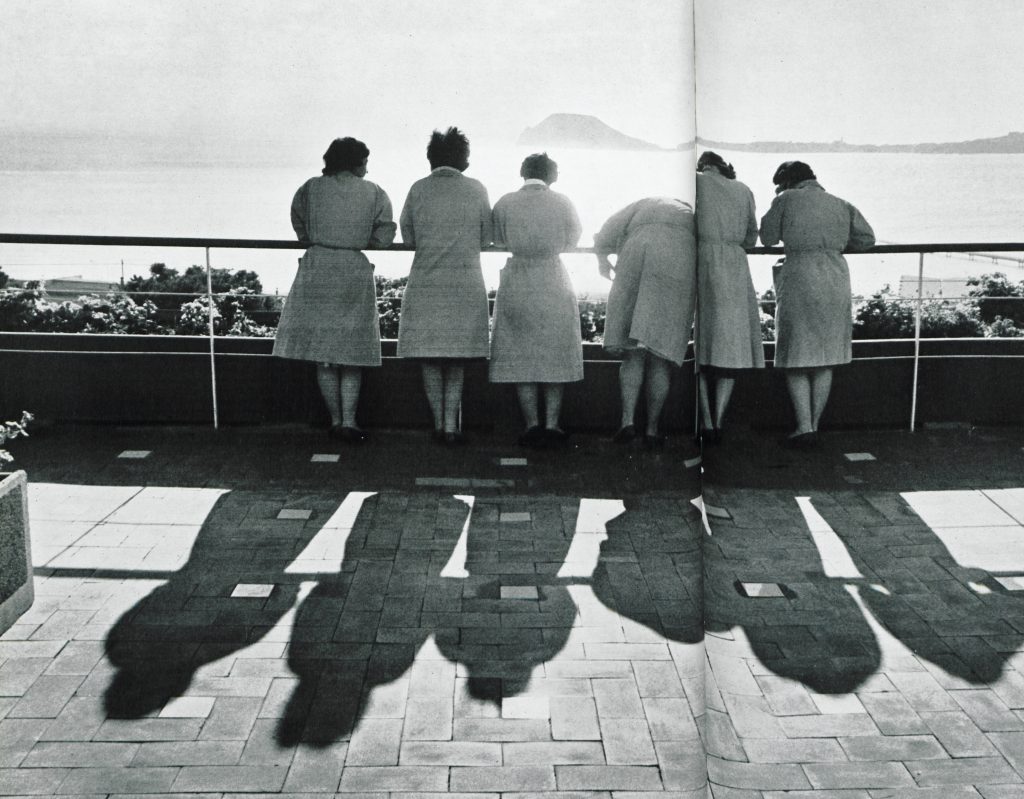
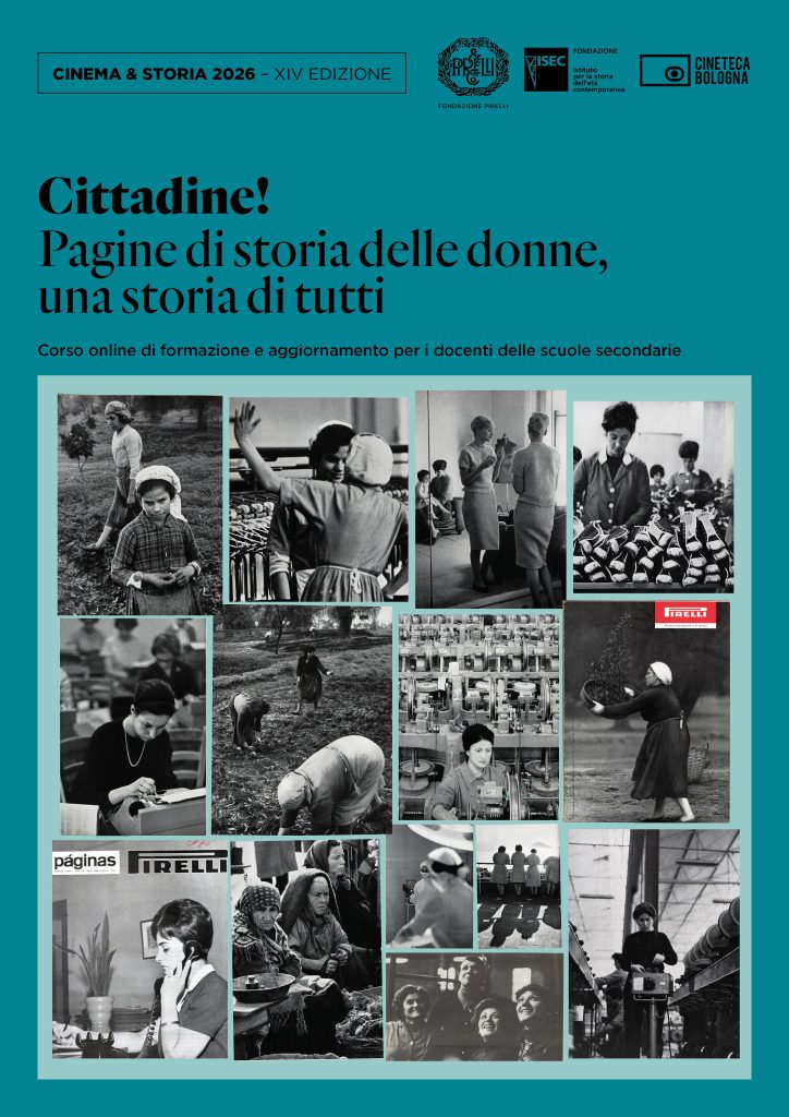
The Long P: Telling Kids
the 100-year History of the Pirelli Logo

More than 100 years have gone by since the famous Pirelli logo was introduced, with the loop of the P stretched out over the other letters of the name, as though it were made of rubber. New York, 1908: “Would this be okay for you?”, asked the visitor straight off the boat from Italy, as he traced out a very unusual-looking P on a piece of paper. “Yeah, it should be”, said the other one, taking a look, “Come to think of it, that would be perfect.” He looked, and looked again with satisfaction, thinking about that capital P sending out boldly on a poster or against the sky. The story was told by Vittorio Sereni, then working at the company’s Press Office, in the pages of Pirelli magazine in 1958, in an article devoted to the success of the logo in advertising. The story, which may have been somewhat embroidered upon, intertwines with other stories that trace the idea of the Pirelli logo back to the signature of the company founder, Giovanni Battista Pirelli, which did indeed have a distinctive elongated P. The oldest example of the famous logo is undoubtedly a bookmark, dating back to 1907, now in the Historical Archive of the Pirelli Foundation: a ribbon bearing the words Pneumatici Pirelli trionfatori della Pechino-Parigi – “Pirelli tyres, winners of the Peking-Paris” – in which all the Ps already have the elongated form, attached to the official Guide to the Corsa di Brescia in September 1907.

The same year also saw the  Peking to Paris Motor Race, in which Pirelli took part, equipping the winning car of the race with its tyres. For the company, this was an important worldwide achievement, and the first of an endless string of victories in all international motorcar races. Pirelli, which in those years was beginning to make the manufacture of tyres its core business, needed a unique, powerful, and recognisable symbol, to assert itself and also to stand out from its competitors. As we clearly see as we scroll through the advertising images now preserved in our Archive, the Pirelli brand has evolved over the years, changing its colour, style, body, and character. The concept of the “Long P” also extended to the products, gradually involving other letters in addition to the “P” of “Pirelli” and “Pneus”.

The institutional logotype has been anything but stable, coexisting for a long time with others without the elongated P and with a series of variations. It was only after the Second World War that it first came to be defined: first, the rules for the base-height ratio were set, together with those for the consistency of the thicknesses and the design of the letters. A second set of rules came in 1961, and there have been more recent changes made by Studio Unimark International and Studio Cerri & Associati. The last restyling was in 1982, by the designer Salvatore Gregorietti and, during the same period, a manual for correct use of the logo was drafted. In 1997, the architect and graphic designer Pierluigi Cerri created a bilingual manual, indicating the correct colour schemes to be used. Over the years, world-class graphic designers and artists helped establish its global renown, creating effective advertising campaigns for Pirelli, in some cases using the logo itself as a graphic element, giving it pride of place in the advertisement. From Stanley Charles Roowy, who already in 1913 transformed it into a powerful racing car, through to Bob Noorda, who curved it into the round shape of a tyre, and André Franꞔois, who in 1961 turned the P into the windscreen of a car with wipers and a moustachioed driver. Combinations of duplications and projections were used in the 1960s and 1970s by Christiane Beylier and Christa Tschopp, and a huge P was formed using real cars for the advertising campaign “Tyres with a Capital P” of 1978 . And so, in the words of Sereni, that “Disney-like intuition, way ahead of its time” that “appears again as a character in a story and in turn generates more characters” is now one of the world’s best-known logos.

Multimedia

Images