

Alan Fletcher: British Humour, Pirelli Style


One of the most original and influential post-war graphic designers, Alan Fletcher shared a clear vision of design through his work: he saw it not as an exercise in style, but as a tool that could turn a simple hunch into a direct and understandable message. Just a few elements, an instantly comprehensible idea, and a healthy dose of British humour: as Fletcher himself put it, “Design is not a thing you do. It’s a way of life.”
Born in 1931 in Kenya, where his father was a civil servant, Alan Fletcher trained in London’s lively creative scene at Hammersmith Art College, the Central School of Arts and Crafts, and the Royal College of Art. In 1956, a scholarship for the Yale School of Architecture and Design took him to the United States. There he engaged with emerging American Pop Art and the demands of corporate communication – two experiences that had a profound influence on his work. In 1962, together with Colin Forbes and Bob Gill, he set up the Fletcher/Forbes/Gill studio, which later became Crosby/Fletcher/Forbes. In 1972, this venture merged into Pentagram alongside Kenneth Grange and Mervyn Kurlansky, creating one of the most significant models in the world of modern graphic design.
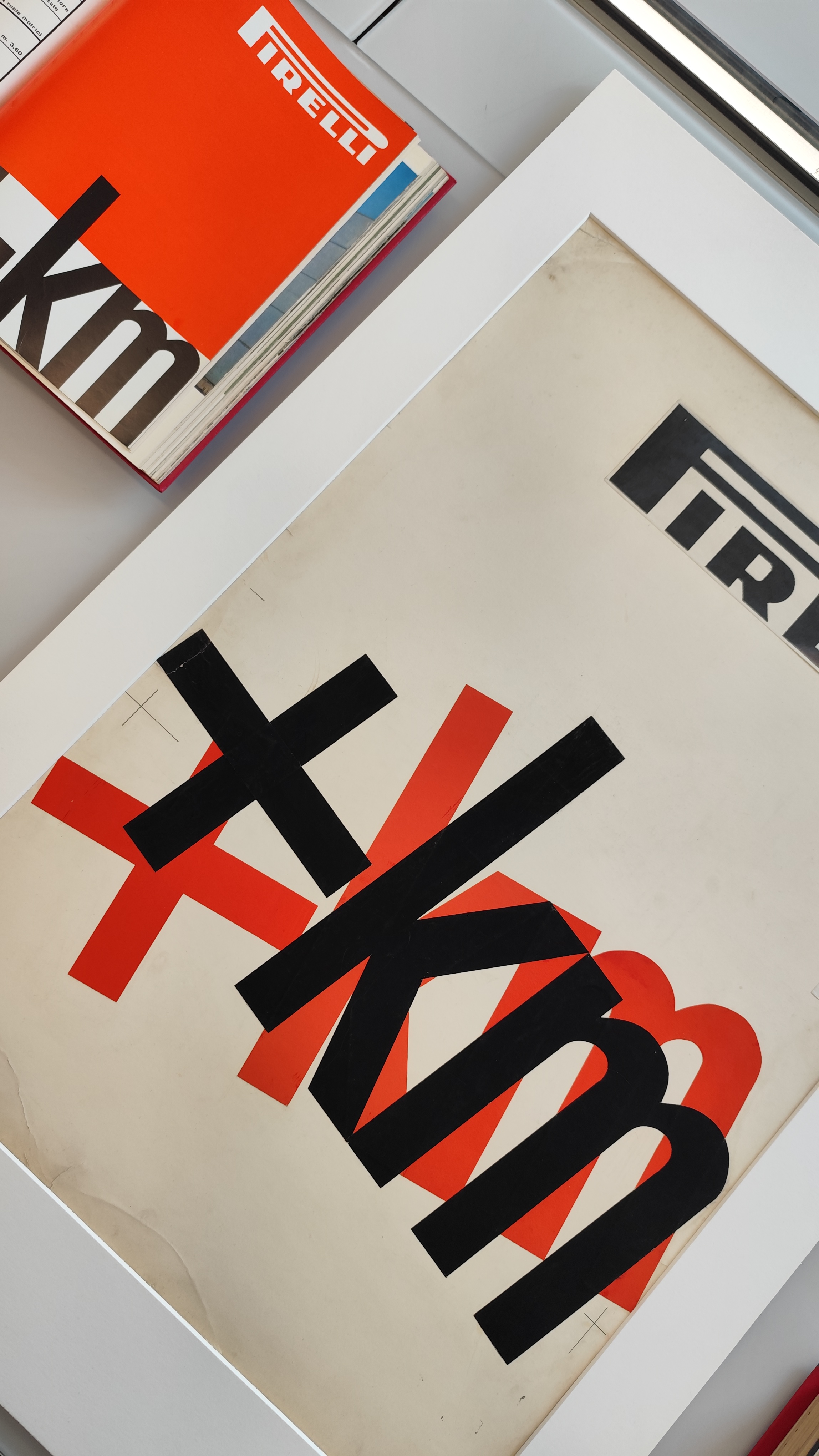
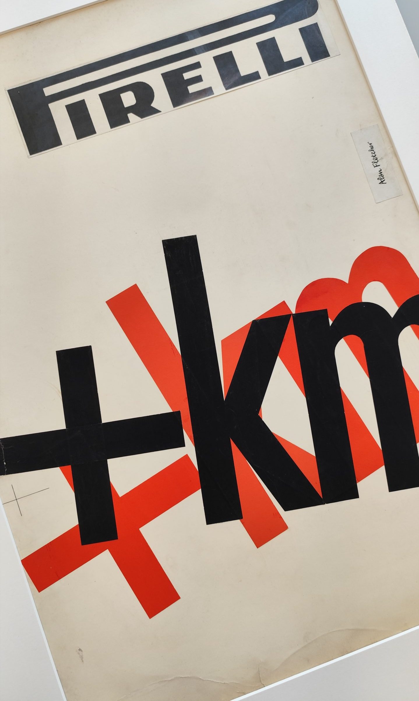
Before returning to England, Fletcher stayed briefly in Milan with his wife Paola in 1959. It was here that he first connected with Pirelli. This meeting led to a partnership that was destined to last for many years and gave rise to some iconic images for the visual branding of the “Long P”. Among the work created for the company, the 1959 campaign for Pirelli tyres is of particular note. Fletcher chose to show neither the product nor the road it would be driven on: right at the centre of the composition stood only the words “+ km”. It was a strikingly simple, almost disorienting idea that turned technical data into an instant message: more miles, longer life, greater strength, with no need to add anything else. This is where Fletcher’s subtle wit shines through: with very few elements, he directly gets across a concept that would otherwise be hard to visualise. It was always a stripped-back, clever solution, perfectly aligned with his view of graphic design: the idea first and foremost.
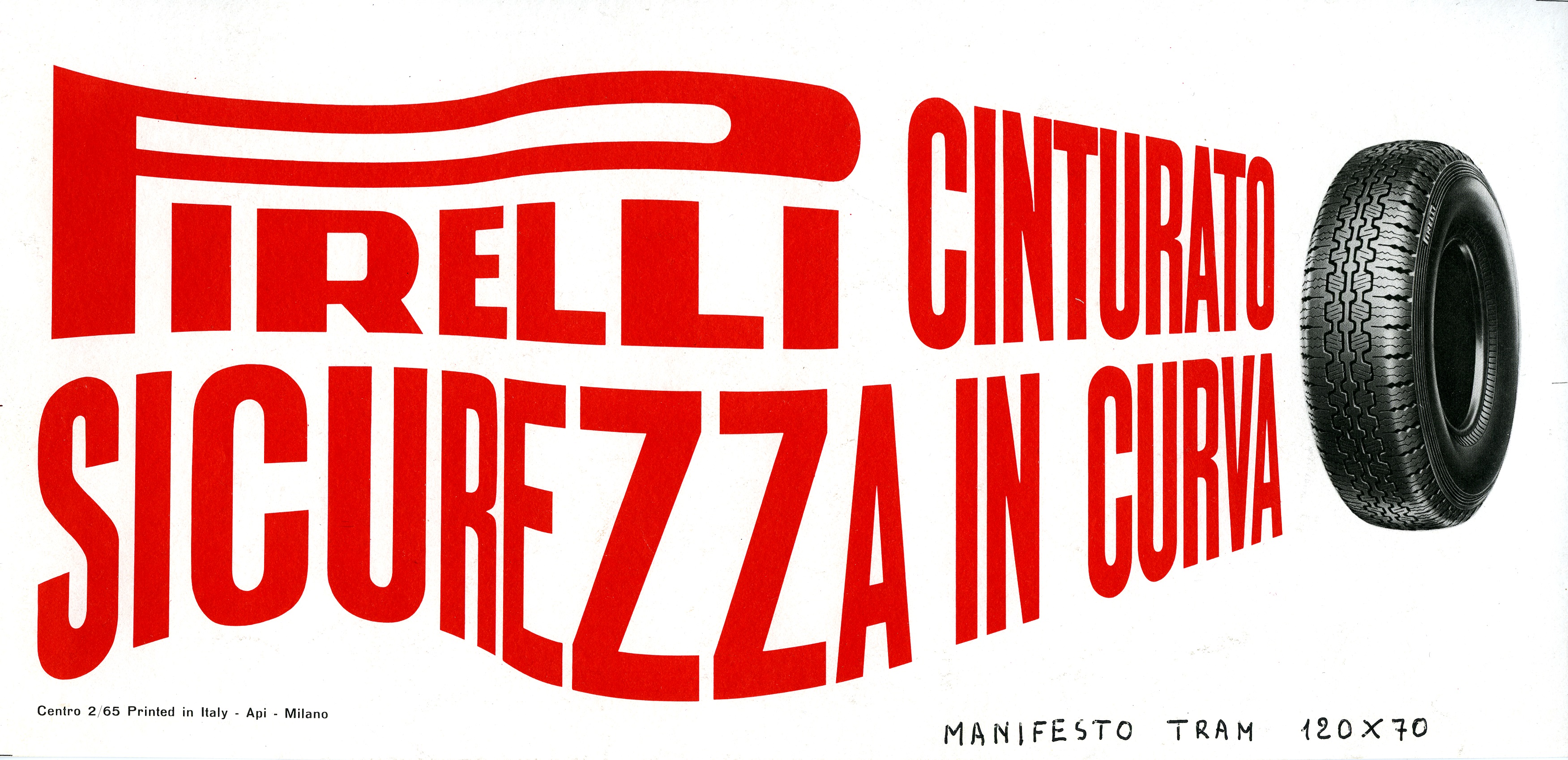
The same principle underpins the Pirelli campaign created for London’s iconic red double-decker buses. Below the windows, a row of black profiles playfully mimics the shapes of seated passengers. The image plays on what usually stays hidden inside the bus, turning the surface of the vehicle into a kind of graphic section that only the viewer’s eye can complete. Another bus featured a clever ad for the Cinturato tyre, where the phrase “safety in cornering” becomes an image in its own right. The words are bent into a winding curve – a complex technical feat at the time – as if following the movement of a car taking a turn. The words do not simply convey the message, for they also visually translate its meaning. The curve takes its shape from the meaning of the words, and the movement of the letters perfectly conveys the idea of the tyre’s stability, control, and safety.
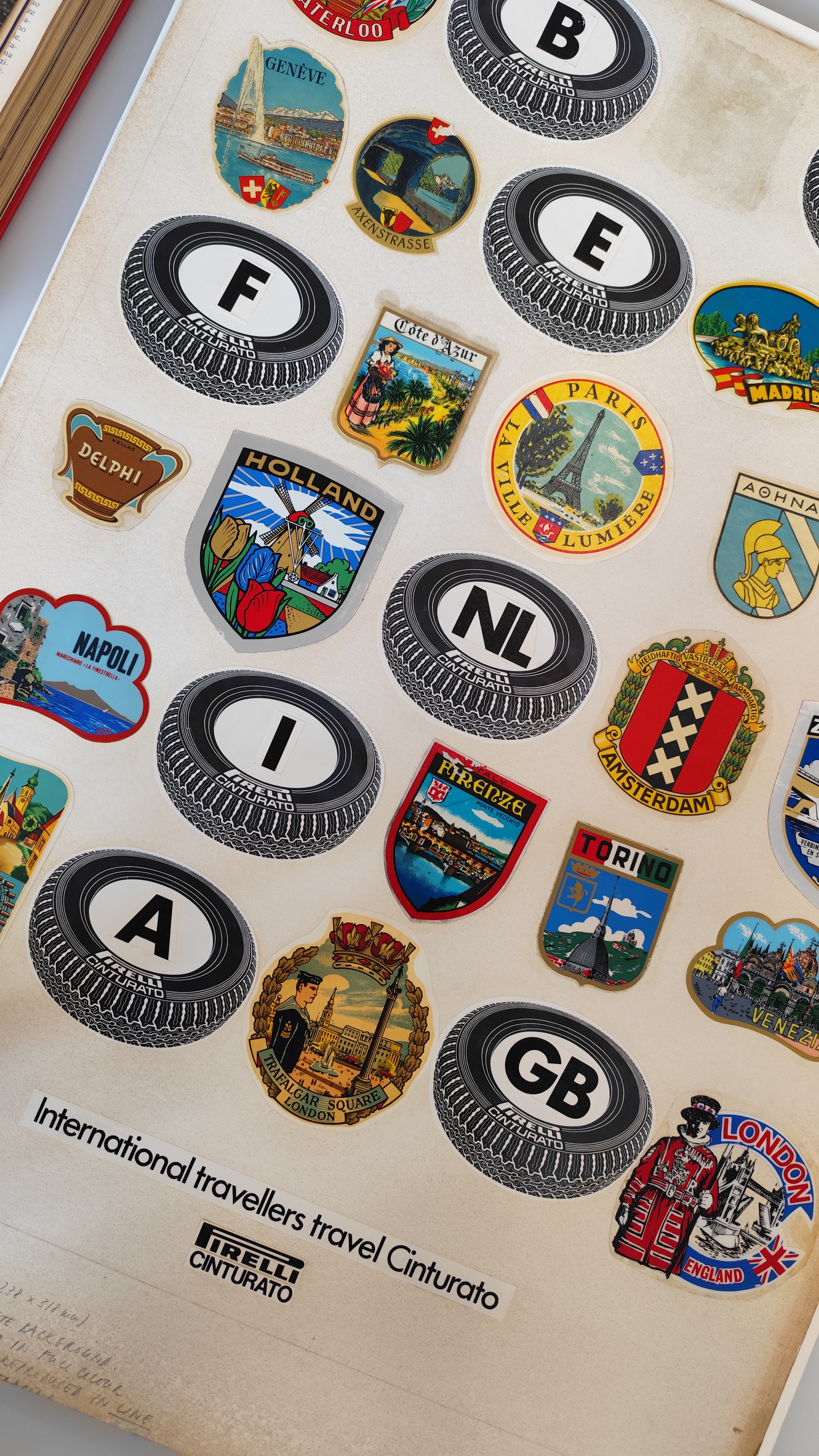
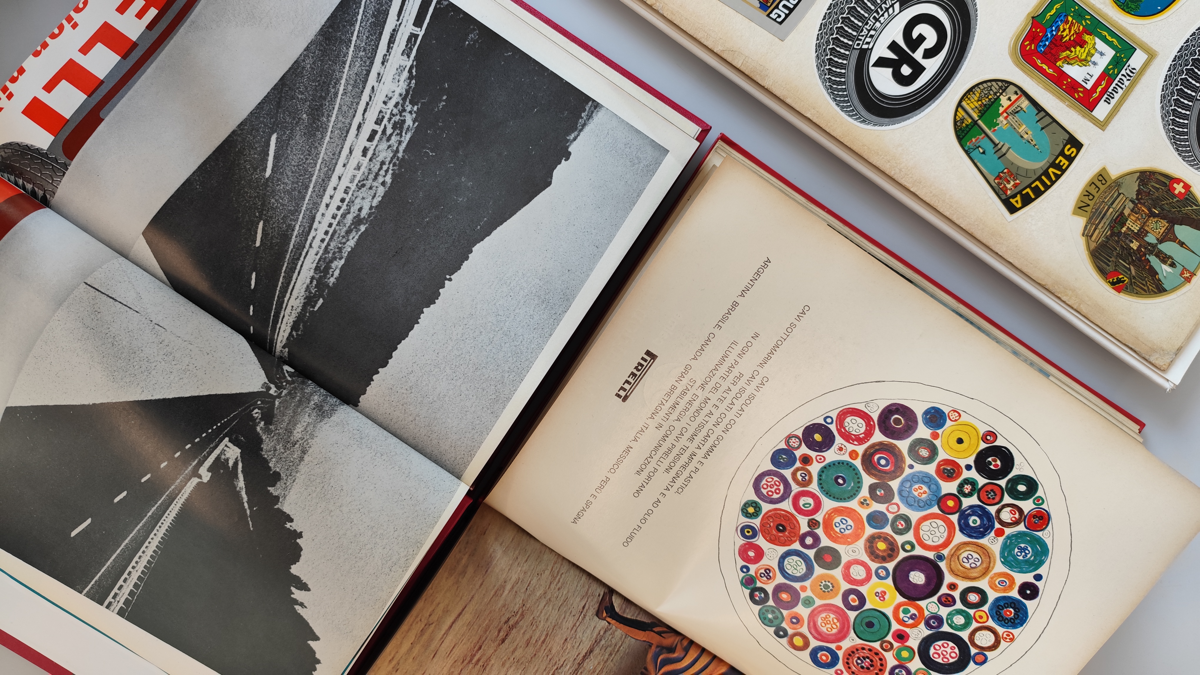
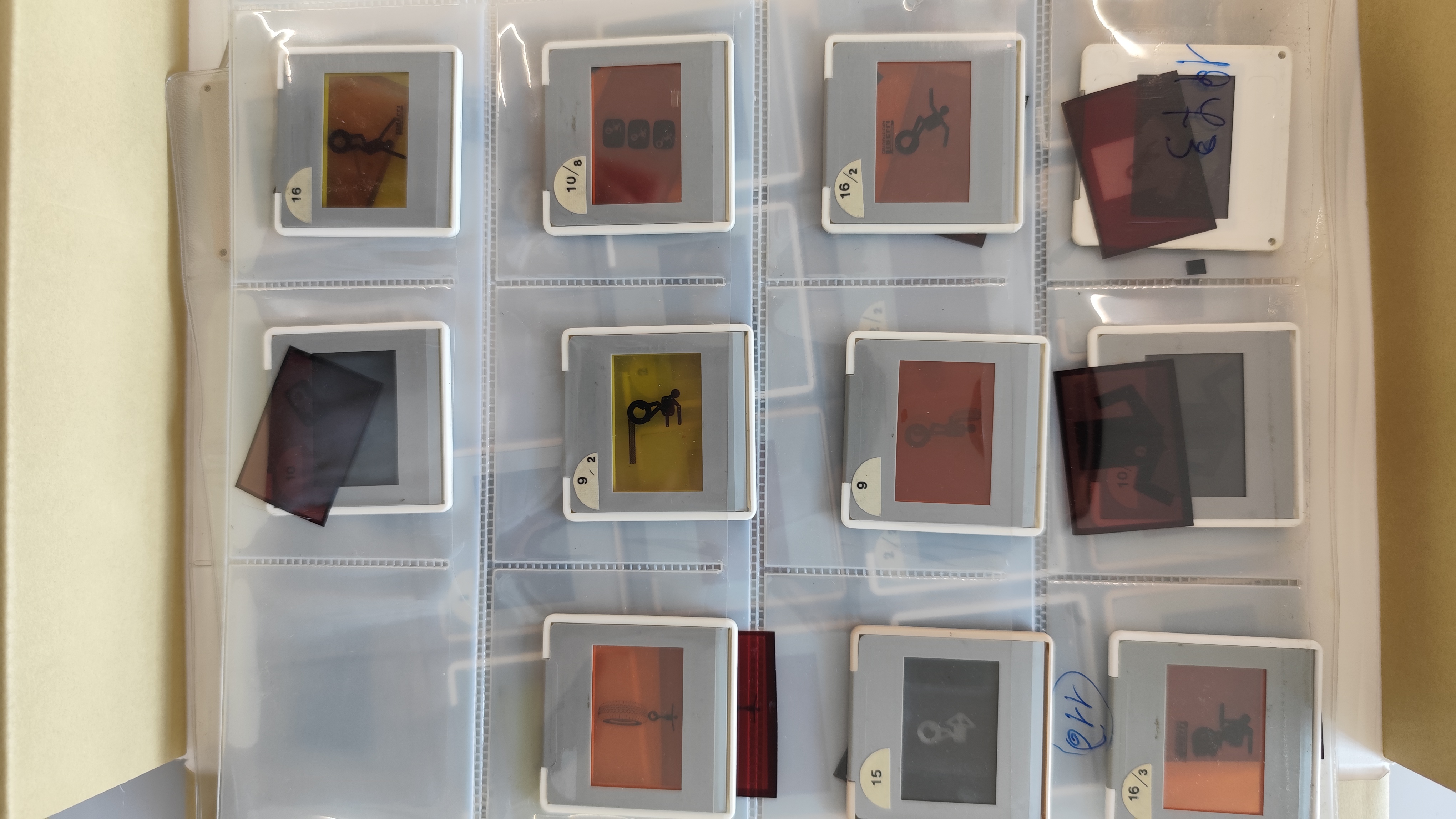
In the following years, Fletcher continued working with different media and products, from Nylon + Rayon to Pirelli cables. For the cables, a top-down view of a cross-section of the wires turns into a pattern of concentric circles, almost as though they were cells under a microscope – a picture that looks scientific but that is also bright, dynamic, and colourful. Here again, the product is presented through visual imagery rather than words. In the 1970s, his work with Pirelli led to the creation of “Pirelliman” – the mascot for the “Ti cerco, ti filmo, ti premio” (I seek you, I film you, I reward you) advertising campaign. This flexible, stylised stick figure appeared in print ads, leaflets for tyre fitters, and stickers. This playful character was designed to create an immediate bond with the public and make the communication more recognisable and engaging, following the rules of personality promotion.
During the course of his long career, Fletcher explored every avenue in graphic design. He moved freely between techniques – from photography and drawing to collage and calligraphy experiments – in a number of different roles. He served as president of the Alliance Graphique Internationale from 1982 to 1985 and was creative director of Domus in the mid-1990s. Just a few months after his death on 21 September 2006, the London Design Museum opened the retrospective Alan Fletcher: Fifty Years of Graphic Work (and Play), which he himself had curated and arranged before he died. The title sums up the very essence of his work: the strength of one of twentieth-century graphic design’s most vital legacies can be found in his power to hold together discipline, creative freedom, and British wit.