Hurtling by… In Graphics, Art and Design
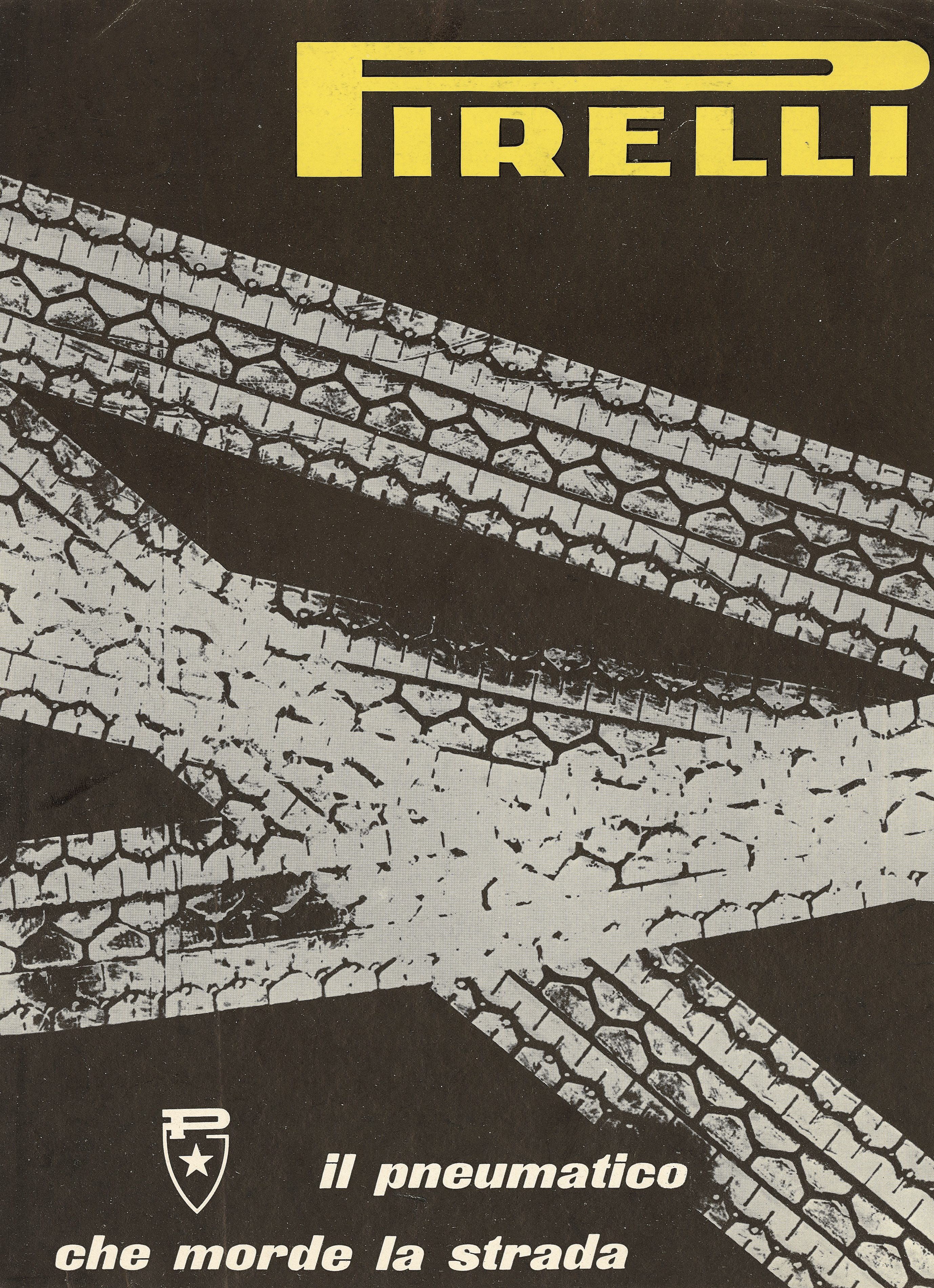
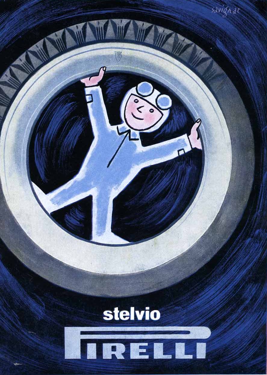
A sense of passion is something that can be found in all of Pirelli’s communication campaigns under the direction of Leonardo Sinisgalli. At a historic time, when motorisation was growing exponentially, the company placed its bets not only on manufacturing increasingly advanced tyres but also on promoting them by bringing in artists and intellectuals who could create a new communication strategy for newsprint, posters, cinema, and direct advertising. The so-called Direzione Propaganda worked across the board to tell the story of the latest models of tyres launched on the market for all manner of vehicles, seasons and driving conditions. To achieve this, Ezio Bonini and Pavel Michael Engelmann’s graphic works were joined by those of Franco Grignani and many other talented artists.
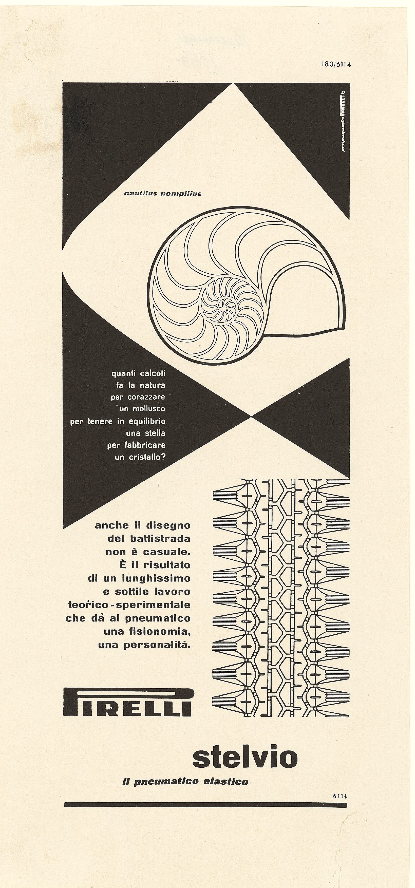
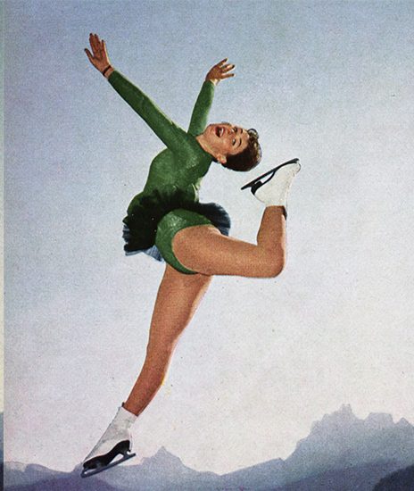
In 1951, Bonini’s Quanti calcoli fa la natura (“How many calculations nature does”) series starts from ideas put forwards by Leonardo Sinisgalli and uses pictures of molluscs, stars and crystals as metaphors for the engineering work (molecules, geometric sequences, genetic sediments) needed to produce a shell, a crustacean or… a Stelvio. The perfect shapes created by nature around us are as amazing as the admiration we feel when we see the way tread patterns are created not by the hand of nature, but by the skills and precision of men and machines. Different visions and forms of creativity enriched Pirelli’s visual communication and helped create the company’s unmistakable style over the decades. In 1952, Pagot Film celebrated the Stelvio in an award-winning animated short in colour entitled Novità al Salone Internazionale dell’Auto di Torino [“News from the Turin Car Show”] directed by Nino and Toni Pagot. In 1956, Franco Grignani created a campaign devoted to travelling. Highly evocative in terms of its landscapes, it offered a new, original take on the technique of collage, highlighting the three key qualities of the Stelvio: flexibility, durability and road holding.
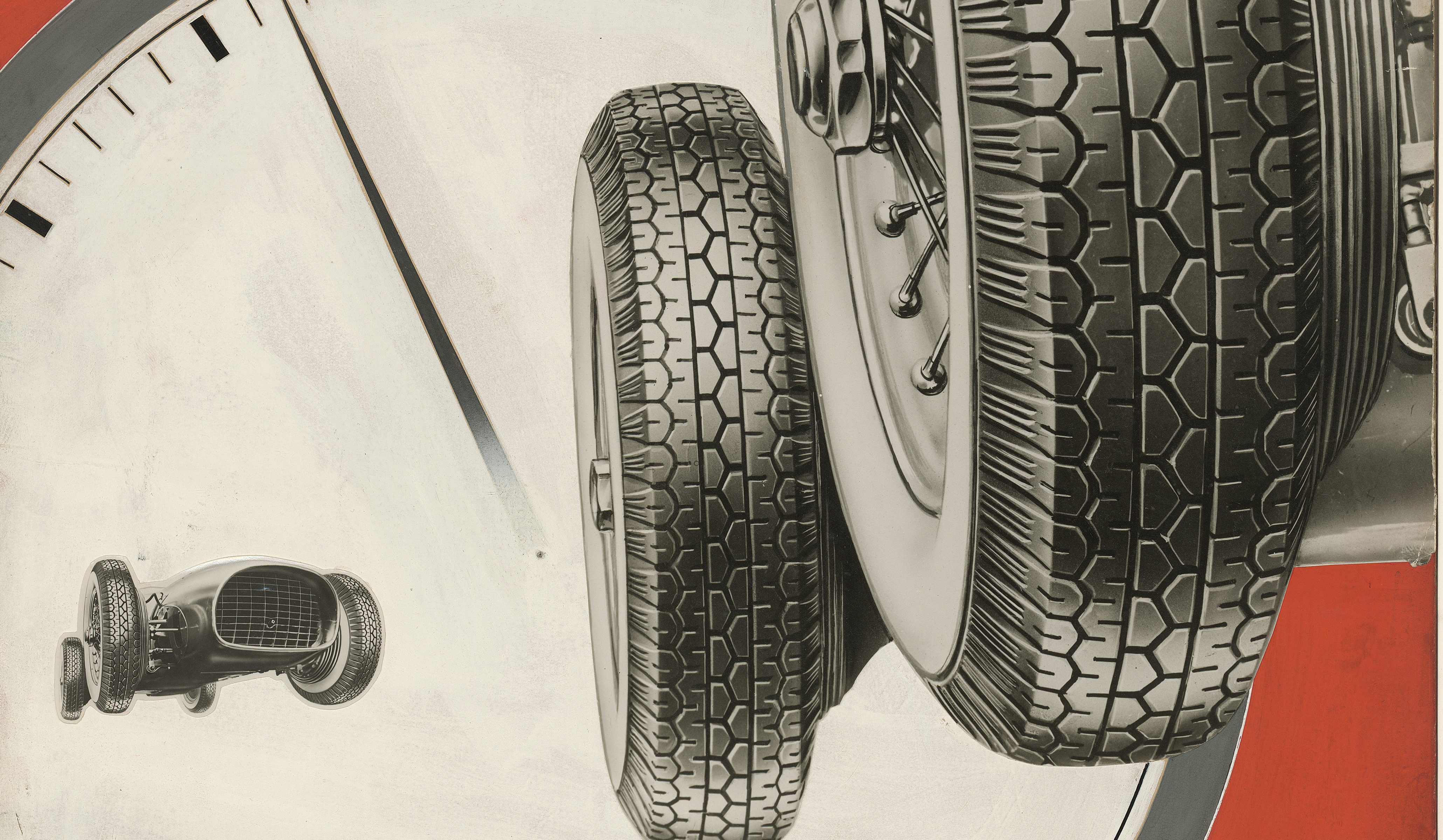
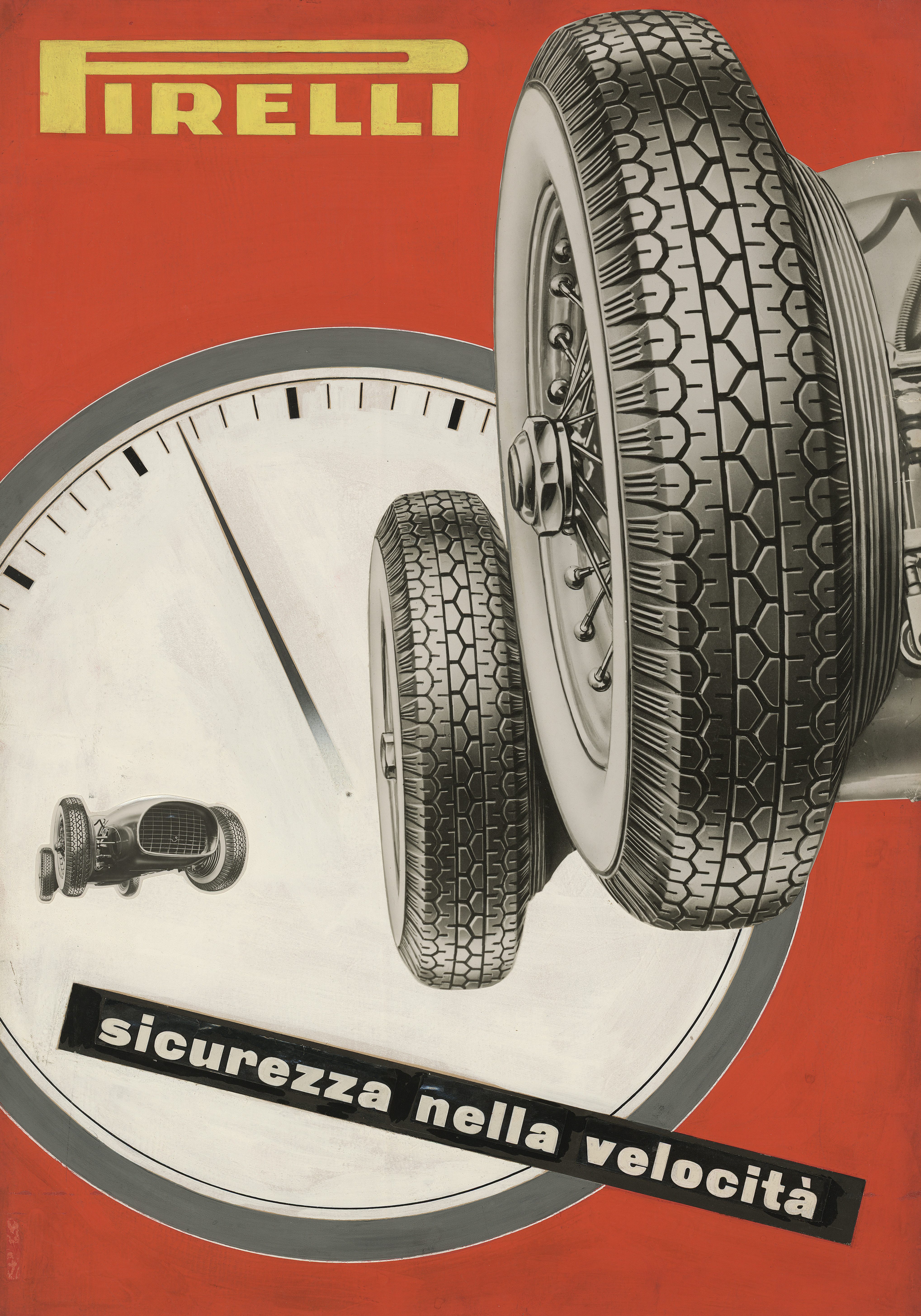
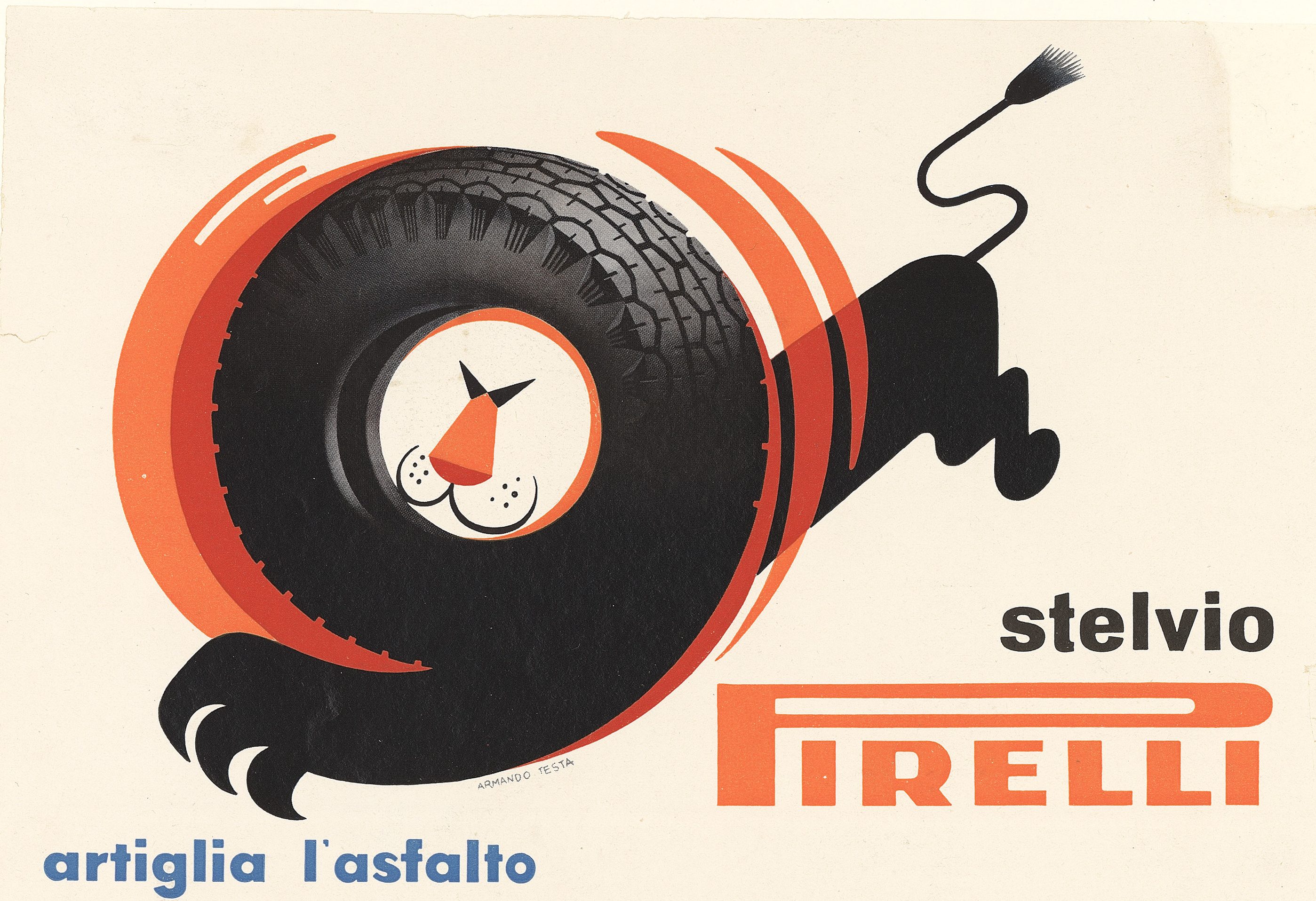
But a more “classic” approach still persisted, as we see in the Sicurezza nella velocità [“Safety at speed!”] campaign by Pavel Engelmann, which followed the evolution of racing tyres from the Stella Bianca to the Stelvio between 1952 and 1954. Here, the dominant colour was the same shade of red that the Futurist Roowy had used forty years previously. Pirelli’s communication also received major awards from a number of international juries – including the Palme d’Or for Advertising, which it won in 1953, and other important honours for its graphic art. What really mattered for the company, however, was the customers’ approval. And this was ensured by Armando Testa and the Artiglia l’asfalto [Claws the Asphalt] poster. The idea of turning the tyre into the mane of a lion, immediately brought to mind the key characteristics of the product: power, grip, and elegance. All in a single minimalist image.