A Minimalist Long P in Pino Tovaglia’s Pop
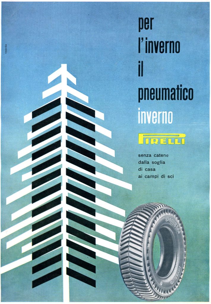
“On the evening of 4 February 1968, Pino Tovaglia went up to the twenty-fifth floor of the Pirelli Centre. It was twenty past six. Tovaglia preferred to meet Castellani in a place of peace and quiet.” It is no coincidence that the article devoted to the recently deceased Arrigo Castellani, which was published in Pirelli magazine in 1969, should begin with a reference to the Milanese designer Pino Tovaglia. The designer and the Pirelli advertising director were friends for over ten years and together they created some of the most famous and brilliant works in the history of the visual communication of the “Long P”. On the one hand there was the meticulous young graphic designer, and on the other Castellani with his Roman ebullience and passion, and his constant desire to go one step farther and astonish people. These two personalities together created an outpouring of creativity and masterpieces. Pino Tovaglia started working with Pirelli in 1957, when Castellani himself took him on, together with five other “superstars” – Antonio Boggeri, Franco Grignani, Erberto Carboni, Ezio Bonini and Bob Noorda – to create a collaborative advertising campaign for tyres: six different styles, six ways of interpreting the product, six artistic forms. Tovaglia’s contribution for the Pirelli Rolle was clear from the outset: clean lines, nothing superfluous, and an “optical” preference for black and white.
His bold style was destined to make its mark in the following decade, at the height of Pop Art, culminating in the Un viaggio, ma advertising campaign for the Cinturato tyre in 1966. Tovaglia’s geometric black-and-white figures that frame and often cover the surreal nursery rhymes invented by Castellani became an authentic cultural symbol in the “swinging” Milan of the late 1960s. The writer Camilla Cederna was clearly amused and fascinated by them in her article for Pirelli magazine: London cannot have been that far away, for the same play of blacks and whites dominated the 1966 film The Tortoise and the Hare made by the British Pirelli Ltd for the Cinturato. Tovaglia’s minimal touch appeared again the following year, when he and Roberto Menghi were asked to think up a novel approach to the Pirelli stand at the Paris Motor Show: an almost hypnotic sequence of black and white lines conveyed the idea of the “radial”, interrupted by a sort of red “heel”. A vision of the Cinturato that is as powerful as it is immediate. Tovaglia and Castellani wrote the last chapter of their partnership in 1968, for the advertising director died suddenly at the end of the year. He did, however, leave behind two more minor masterpieces. One was the “flags” advertising campaign: the Pirelli Cinturato known in every country of the world, shown only by its stylised national flag. The other was the cover of Pirelli magazine no. 3 of that year – the one for which Tovaglia went up to the twenty-fifth floor of the Pirelli Tower that evening on 4 February. The meticulous designer once again wanted to provoke the vivacious manager, knowing that, as usual, he would come out on top in their friendly duel: “The time of man. Work and more” was written on the cover. In black and white – of course.