Feminine Graphics: Female designers for Pirelli Adv
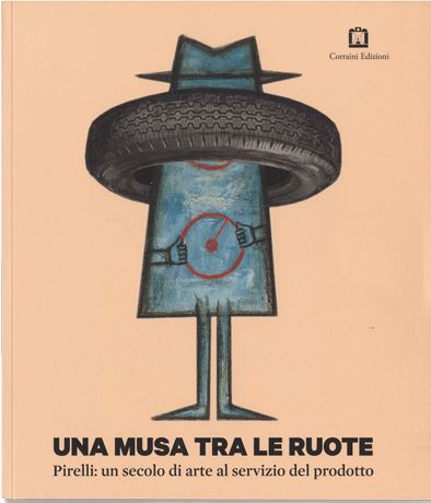
An all-female Pirelli in March 2018. We have talked about actresses as advertising endorsers, and about women writers. So we could now hardly fail to mention those women designers who, in the 1950s and ’60s, helped create a graphic style that is virtually unparalleled in the history of visual communication. Our story winds its way through two books, both of them edited by the Pirelli Foundation and published by Corraini Edizioni: A Muse in the Wheels (2015) and Advertising with a Capital P (2017). These two volumes examine and record the history of Pirelli advertising – the former from the late nineteenth century through to the 1960s, and the latter from the 1970s to the early 2000s. In other words, from the age of the draughtsman-painter who created a unique masterpiece to the age of infinitely reproducible computer graphics – from the “free thinker” artist to the supremacy of creative agencies. The designers we have chosen well reflect these two periods: Jeanne Michot Grignani on the one hand, and Christiane Beylier and Christa Tschopp on the other.
Jeanne Michot – an illustrator and costume designer who later married the designer Franco Grignani – was born to French émigrés in Ukraine. After the October Revolution in 1917, the family fled from Russia to western Europe, first to London and then to Paris and, lastly, to Italy. From the time she was a little girl, Jeanne had a passion for drawing, of fashion in particular. Together with her husband Franco, she worked on some of the great advertising campaigns for many important Italian brands: for Pirelli, Jeanne Grignani designed the supremely elegant collection of raincoats made by the Arona company from 1950 to 1955. The models and garments are rendered with soft, rapid brushstrokes: the beautifully feminine women wear garments with a wispy waist and raised collar, and trench coats with big sleeves. This was the fashion of the economic boom.
Then the boom busted and the very concept of creativity changed, as did the way of creating visual communication. The time had come for advertising agencies, who worked to precise briefings given by the companies. Pirelli had its own internal agency, which it called Centro, with a stream of graphic designers of the new era. The collection of images in Pirelli Advertising with a Capital P, which also examines the work of the Agenzia Centro from the late 1960s, starts with graphic works once again with a “feminine” take. 1966 was the year when the designer Christiane Beylier gave an instant perception of the global reach of the Pirelli Group – showing how it was multi-national and multi-product, and able to work in a variety of sectors – playing with the pliability of the company logo. The Long-P symbol allowed her to experiment with a play of duplications and projections that she used to give almost living form to the company’s various activities: from the refractivity of the “products for the home” to the geometries of “tourism and sport”, through to the concentric circles of the shipping sector and the yarn-effect of products for the textile industry.
Then Pop Art reached its height: experimenting with the universal language of signs that found its place in advertising campaigns made up of countless Pirelli logos, as imagined by Christa Tschopp for Agenzia Centro in 1970. The dawn of the Computer Age was breaking.